It’s been quite a while since we at Bizagi started implementing the latest design principles to our products; a wild ride where we’ve gone from skeuomorphic guidelines to flat ones but something was amiss in the process. Nowadays we’ve got a good number of products but none of them look alike; they don’t look like part of a whole, and they definitely should.
With that in mind I've come up with something special; something I call ‘Vanguard Design‘.
Now, what is exactly ’Vanguard Design’? It’s basically an amalgam of both Google and Apple’s design guidelines, taking their stronger concepts, mixing them and giving them a special twist to make them our own. In short, it will take all advantages of Google’s usability explorations while looking as good as Apple's.
The main features you’ll be able to tell on Vanguard Design works are:
Cards are a 'thing': One of the most important paradigm breakthroughs when it comes to usability is the use of cards. They hold both visual, textual and hypertextual information while being infinitely flexible without losing any kind of organisational composition on the interface.
Spatial awareness: Shadows are back and here to stay, and now they make sense within the UI. Perceiving the interface as a 3D canvas, shadows are projected right over it with a realistic approach, strengthening the notion of ‘relevance’ within all present elements.
Dynamic color palettes: It’s not about vibrant colours or plain ones; it’s also not only about following the branding colours as is. It’s about all of it and then some. In order to give a fresh-yet-corporate look we take one bright-acid color and mix it with a dark-stoic one. This is spiced-up with real world images that greatly enrich the visuals and add a whole new layer to the look and feel.
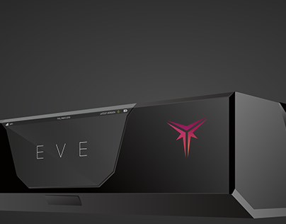
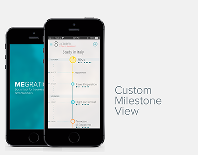
An overall awesome look and feel: We could go on for hours about why our design guidelines rule, but an image speaks louder than a bunch of concepts. Take a look at how Bizagi products are set to look this 2016.


